Everybody loves video content
Whether it’s for direct or content marketing or to more easily and quickly getting your message out to your audience, video is increasingly popular. The reality is that in a media saturated world where everybody feels pressed for time, video is simply easier to ingest.
There’s a ton of data to back this up. For example, Hubspot research has shown that 45% of people watch an hour or more of video every day!
Video content can include anything from Vlogs (video blogs), interviews, tutorials, recorded presentations, testimonials, ads and beyond.
Though I’m personally a huge fan of reading, as a marketer I simply can’t ignore the power of this data and what it means for the consumer:
Aberdeen Research has shown that companies who use video marketing
grow revenue 49% faster than those who don’t.
They also:
- get 27% higher click-through rates
- enjoy 41% more web traffic from search
- and 34% higher web conversion rates
That’s amazing! Undeniable power in your pocket. So, all you have to do is record, post up to Vimeo or YouTube, embed in your blog or webpage and then share away, right?
Well, if you pulled out that handy device you use to surf the web and communicate with the world so easily out of said pocket to pull up your fabulous new video? You’ll realize that they don’t automatically scale to mobile view, aka: they are not automatically mobile responsive. And if you’re not mobile friendly in this day and age, you’re dead in the water.
So, what do you do?
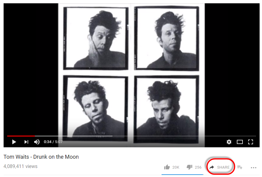
Good news! I have a handy tip for you. It involves code, so may sound scary at first, but really is easy to implement. I’m going to use an example of this Tom Waits song “Drunk on the Moon” to show you what to do to easly embed a mobile responsive video.
Step #1: Get the Embed Code from wherever your video is hosted. First click “Share”.

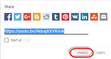
Then – ‘cause you’re not going to “just” share the video – you’ll select the Embed option.
That’ll pop up a window that will give you a code snippet to use on your blog or a site page. It’ll look something like this:

| <iframe width=”560″ height=”315″ src=”https://www.youtube.com/embed/NduqttXVKmA” frameborder=”0″ allow=”autoplay; encrypted-media” allowfullscreen></iframe> |
From here you need to modify the code to put it into what’s called a “responsive container”. That looks like this:
| <div class=”responsive-container”> <iframe src=”//www.youtube.com/PUTYOURSPECIFICEMBEDCODEHERE/” frameborder=”0″ allowfullscreen=”allowfullscreen”></iframe></div> |
See how the div container removed the fixed height and width of the original embed code?
Using our example embed link from above, here’s a working example if I really did want a mobile responsive video of Tom crooning from my website:
| <div class=”responsive-container”> <iframe src=” https://www.youtube.com/embed/NduqttXVKmA ” frameborder=”0″ allowfullscreen=”allowfullscreen”></iframe></div> |
Want to see if it worked? Pull it up on your mobile phone (if you’re not already on one) and see if Tom looks like the video’s the right size!
NOTE: A lot of video tech has caught up with the times since I wrote this and you might not need to do this. But if you notice your video isn’t mobile compatible? Give it a try!
Need help with something similar on your own site? Please don’t be shy – shoot me a note and we can set up a time to talk!